
Mount the Frame, Not the Picture
An icon needs a frame to hang in and a picture to hang there. @web-portfolio/icons and @web-portfolio/icons-sanity exist so a developer only ever mounts the frame — the picture can come from wherever that decision actually belongs.
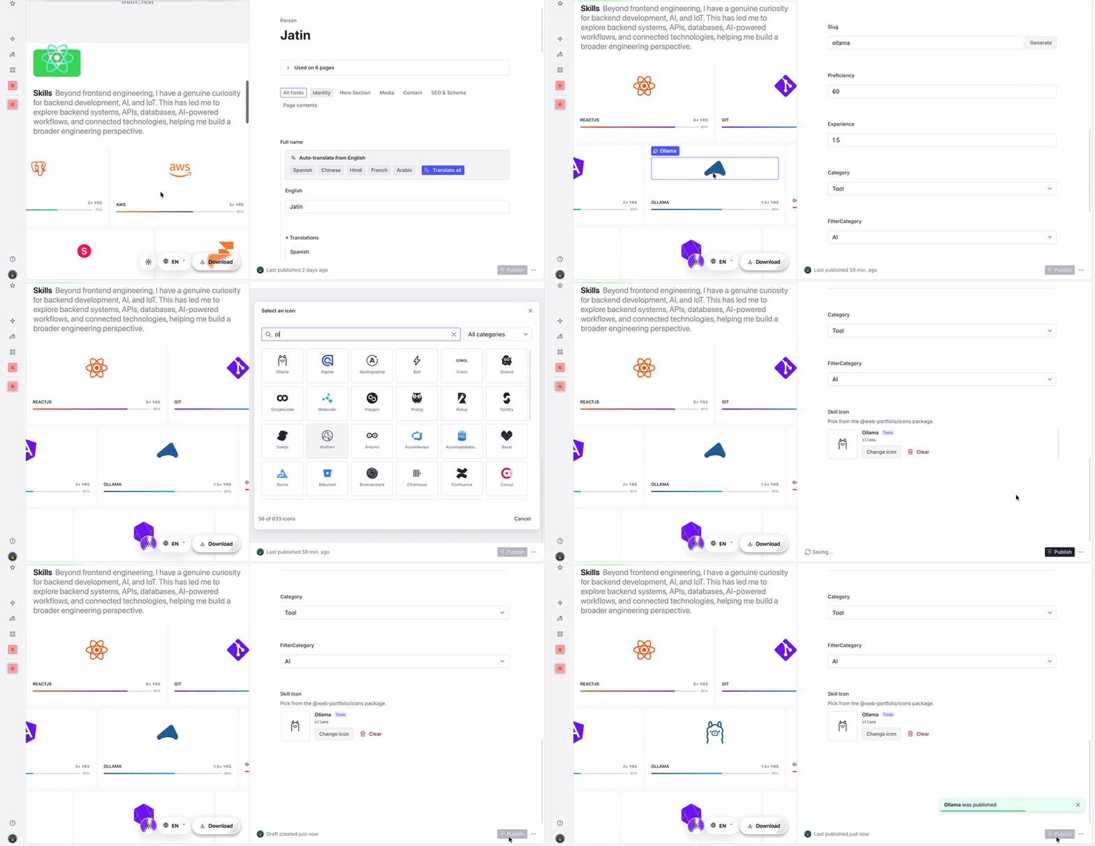
This started as a question, not a plan: should an icon be content, or code? A portfolio's skill list changes more often than its components do — a new skill means a new icon — so treating icons as something Sanity could hold, editable without a redeploy, felt like the obvious call. It wasn't obvious for long.
Where 'icon as content' actually led
The first version stored an icon as raw SVG markup in a plain text field, because that's the obvious shape for "icon as content": an editor pastes what they have, the frontend renders it. That's also where it stopped being obvious.
Every pasted icon came from somewhere different — one export with a clean two-color path, another with a hardcoded fill and a nested <g> full of inline styles no editor could see or remove. Some had a 24×24 viewBox, some 512×512, some none at all. There was no one shape to build a component around.
So the component tried to force one — a size, a color, a stroke — and that's the part that made uniformity worse, not better. currentColor only works if the source markup doesn't already hardcode its own fill, and a stroke-width override doesn't apply either once an icon sets its own. Every newly pasted icon needed its own case, which defeats the point of a content field that's supposed to need no code changes at all.
A content field that needs a code change every time someone uses it isn't really a content field.
Underneath all of it was the actually dangerous part: that field was rendered with dangerouslySetInnerHTML, injecting whatever got pasted straight into the DOM — a real security risk, not just a formatting one. Patching around it kept adding code without touching the actual problem: the field's value was still just whatever got pasted into it.
The code-only fixes don't solve it either
Falling back to how everyone else handles icons in code doesn't get the content question back, though. Icon fonts glue frame and picture into a class name — <i class="fa fa-docker"> — and a typo just renders blank. Sprite sheets glue the same way, through an id instead. Inline SVG components glue hardest: the picture is baked into the import graph, so there's no registry, and no field, at all. Third-party libraries like lucide-react get the developer experience right, but import { Docker } is still a code change, just a nicer one.
Each is a perfectly reasonable way to write an icon in code. None of them let which picture shows up change without touching code — which was the entire point.
Mount it: a frame that just wants a picture
@web-portfolio/icons unglues that. <Icon> is a frame — its name prop takes a picture from a registry packages/core builds by reconciling devicon, Material Symbols, and Simple Icons through SVGO. <Icon> can't tell a literal from a variable, so the same call works either way:
import { Icon } from '@web-portfolio/icons'

<Icon name="docker" size={32} />          // a literal picture
<Icon name={skill.icon} size={32} />       // a picture from a CMS field
That's the opening @web-portfolio/icons-sanity needed: a picture is just a string, so it can come from an editor picking it instead of a developer typing it. Its iconRef schema type turns a field into a searchable grid in Sanity Studio — IconPickerInput only ever writes back a picture it found in the same registry <Icon> reads. A developer's job was never to choose the picture — just to mount the frame.
It's worth counting the cost, too: since both packages bundle the same registry, the only thing that crosses the wire from Sanity to the frontend is that string — ~7 bytes on average, against ~955 bytes for the median icon's actual markup (up to several KB for a complex logo). Storing raw SVG in a CMS field instead — the workaround this plugin exists to avoid — costs 130–285× more per icon, on every fetch. Icon fonts and sprite sheets dodge that too, by referencing a name; inline SVG components and import-based libraries can't, not without first building the exact registry this package already is.
That same swap fixes a common pain point: shipping an icon before design approves one. Hang the closest picture today — name="link" — and change just that value once the real mark ships, no re-import, no new component. Route it through a CMS field instead and whoever owns the moment — design, marketing, whoever's running this week's campaign — swaps the picture themselves, in Studio, no PR at all.
The placeholder ships in the same commit as the feature. Only the picture changes later.
Where it actually wins
Graded against the same four approaches, split into three questions: what's it like to write, what does it cost at runtime, and what happens when the icon needs to change and the person changing it isn't a developer.
Writing it
icons + icons-sanity Same registry, editable from Studio | @web-portfolio/icons <Icon name> against the bundled registry | Third-party library Import each icon by name | Inline SVG Each icon hand-copied into its own file | SVG sprite One <symbol> sheet, referenced by id | Icon font A class name picks a glyph | |
|---|---|---|---|---|---|---|
| Adding an icon in code | Same call — the string can come from a field | <Icon name="docker"/> — one prop | import { Docker } — editor autocompletes | A new component file per icon, copy-pasted | #docker — same blind-typing risk | fa-docker — nothing checks the glyph exists |
| Type safety / autocomplete | Picker only writes real keys — a Studio guarantee, not a type one | name is a plain string — a typo only warns | Named exports — a typo fails the build | Each icon is its own named import | An id string — same problem | A class name string — nothing checks it exists |
| Styling — color, stroke, size | Same props, same component | size/color/stroke props on <Icon> | Typed size/color/strokeWidth props | Only as consistent as whoever pasted it | fill: currentColor works cleanly | Color inherits, but weight is baked into the glyph |
Running it
icons + icons-sanity Same registry, editable from Studio | @web-portfolio/icons <Icon name> against the bundled registry | Third-party library Import each icon by name | Inline SVG Each icon hand-copied into its own file | SVG sprite One <symbol> sheet, referenced by id | Icon font A class name picks a glyph | |
|---|---|---|---|---|---|---|
| Bundle impact | Same cost as icons alone | One registry — pulls in all 633 icons | Tree-shaken per icon | Only imported icons ship | Ships every icon in one sheet | Whole font file loads either way |
| Runtime selection | Same, via the picker | No wiring needed | Same — build the map yourself | Needs a manual name map | Already id-keyed | Already string-keyed |
Living with it
icons + icons-sanity Same registry, editable from Studio | @web-portfolio/icons <Icon name> against the bundled registry | Third-party library Import each icon by name | Inline SVG Each icon hand-copied into its own file | SVG sprite One <symbol> sheet, referenced by id | Icon font A class name picks a glyph | |
|---|---|---|---|---|---|---|
| Selecting from dynamic data | Lives in Sanity content, updates without a redeploy | name can come from anywhere — nothing helps you set it right | Same — each icon is a component, not a lookup key | The icon is a specific import, not a swappable value | Same — an id string with no picker | A string — nothing renders a picker for it |
| Non-developer control | IconPickerInput ships that picker already built | No editing surface — still a developer changing a prop | Same — it's a code-level import | Changing the icon means changing code | Same — someone still has to build that picker | Needs a hand-built picker that knows glyph names |
| Adding a brand-new icon | Same constraint — an admin's raw-SVG paste is the escape hatch | Seed the source, run generate-registry, republish | You get whatever the library ships, nothing else | Paste the SVG, done — no shared file to touch | Edit the sprite file, redeploy | Regenerate the font file, rebuild, redeploy |
| Consistency across sources | Same registry — Studio also flags a value that's since gone stale | Multiple icon sets reconciled into one registry | Consistent internally, but brand logos usually aren't in it | No shared discipline unless someone enforces it | Only as consistent as what went into the sheet | One family, one visual language, by construction |
| License & provenance | Same attribution, inherited unchanged | Attributed once per source, in the registry and README | One license for the whole package, typically clear | Untracked — attribution lives with whoever pasted it, if anyone | Usually untracked once icons are copied into one file | Whatever the font package's license says, rarely per glyph |
Bundle impact, @web-portfolio/icons row: the ✕ is a client-side cost only. Render <Icon> in a server component and the registry never reaches the browser at all.
The trade-off, no sugar-coating it
Two rows above are genuine downsides: bundle size, and type safety. Bundle size loses because registry.generated.ts holds every icon in one object, not separate pieces a bundler can trim — so <Icon> pulls in all 633 icons even if a page uses one. A plain import-based library dodges that cost only by giving up runtime selection, which defeats the point of storing icons as content. The fix, from the footnote above: render <Icon> on the server, and the registry never reaches the browser — the size gap disappears. That's also just the right default for icons in general, especially now that they can be content instead of code: the value only exists at request time, so there was never a reason to ship it to the browser. Rendered this way, <Icon> matches inline SVG and a trimmed import on zero extra JavaScript, and beats a web font (still needs its own file) and a sprite sheet (bundles everything, or costs its own request).
Type safety splits the same way. Type a name by hand and it's just text — nothing catches a typo. icons-sanity's picker only lets an editor choose a name that actually exists, but that guarantee lives in the Studio interface, not the underlying schema — a typo can still slip in from outside Studio. Enforcing it at the schema level is planned for the next minor release.
When you should actually reach for this
This fits a CMS-backed project — portfolio, agency site, marketing page — where "which icon" is a content call, not an engineering one. If nothing's ever edited outside the codebase, just take the tree-shaken library: the picture was always going to stay the same, so there was no frame worth mounting in the first place.
Get the frame right once, and swapping the picture stops being a renovation — pull one out, push another in. The frame stays on the wall: no new holes, no risk of knocking it crooked. That's the actual payoff of building the registry and the picker: <Icon name>, the registry, and IconPickerInput don't change again. Only the name passed to them does.
Mount the frame, hand the picture over, get back to shipping.